
Introduction
Mobile e-commerce on HubSpot is no longer a secondary consideration for growing online stores. In most HubSpot portals we work with today, mobile traffic already accounts for the majority of visits. Yet many of these stores are still designed with a desktop-first mindset and only adjusted for mobile later.
After working on HubSpot CMS projects for over a decade, this is one of the most common patterns we see. Teams invest heavily in products, content, and campaigns, but lose conversions on mobile because the experience simply is not built for how users browse and buy on smaller screens.
This article breaks down what actually matters when building mobile e-commerce on HubSpot, where most stores struggle, and how the right structure and theme decisions can directly influence UX and sales growth.
Table of Contents
Why mobile UX matters more for e-commerce than any other channel
Mobile users behave very differently from desktop users. They scroll faster, make quicker decisions, and have far less patience for friction.
When teams review mobile performance issues, mobile e-commerce on HubSpot often exposes problems that were not obvious on desktop. Common symptoms include:
- High mobile bounce rates
- Low add-to-cart actions
- Drop-offs before checkout
These issues are rarely caused by HubSpot itself. In most cases, they come down to layout density, navigation complexity, and performance decisions made at the theme level.
A mobile-first approach is no longer optional for e-commerce websites built on HubSpot CMS.
Mobile navigation and product discovery on HubSpot
Navigation is one of the most underestimated elements of mobile e-commerce UX.
On mobile devices, users rely heavily on:
- Clear menus
- Search functionality
- Logical category structure
For mobile e-commerce on HubSpot, best practices include:
- Keeping top-level navigation minimal
- Prioritizing product categories over static pages
- Treating search as a primary discovery tool, not an afterthought
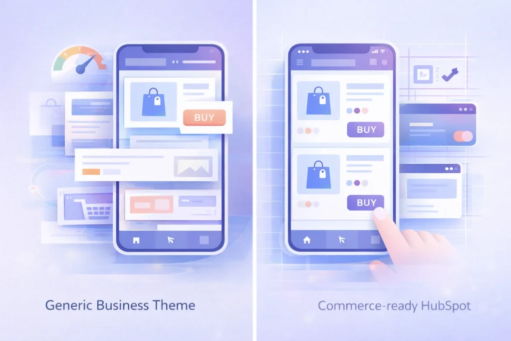
In our experience, stores built on generic business themes often struggle here. The navigation looks fine visually but breaks down once product catalogs grow. Commerce-focused HubSpot themes are designed differently, with mobile discovery patterns built in from the start.
Optimizing mobile product pages for conversions
Product pages are where mobile UX decisions directly impact revenue.
Optimizing product layouts is critical because mobile e-commerce on HubSpot relies heavily on clarity and hierarchy. On smaller screens, users should immediately understand:
- What the product is
- How much it costs
- What action to take next
Key mobile product page best practices include:
- Fast-loading, well-scaled product images
- Clear pricing and call-to-action placement
- Minimal distractions above the fold
- Touch-friendly buttons with proper spacing
Using structured, reusable product modules ensures consistency across the catalog and prevents one-off fixes that become technical debt later.
Page speed and performance on mobile devices
Page speed is one of the biggest conversion factors for mobile e-commerce on HubSpot, especially for stores with large product catalogs.
Mobile performance issues usually stem from:
- Unoptimized images
- Heavy scripts added over time
- Layout shifts caused by late-loading assets
Over the years, we have seen teams try to fix these problems incrementally, only to realize the root issue was the original theme architecture. Choosing a theme built with performance in mind reduces long-term maintenance and keeps mobile experiences fast as the store scales.
Mobile checkout experience on HubSpot
Checkout is where most mobile e-commerce sites lose customers.
For mobile e-commerce on HubSpot, common checkout problems include:
- Too many form fields
- Poor spacing between inputs
- Confusing validation messages
Best practices for mobile checkout include:
- Reducing required fields wherever possible
- Using clear labels and generous spacing
- Designing for thumb-first interaction
A well-structured e-commerce theme simplifies mobile checkout design by aligning layouts with HubSpot’s form and CRM capabilities, rather than fighting against them.
HubSpot vs traditional platforms for mobile e-commerce
To understand why mobile UX struggles persist, it helps to compare HubSpot CMS with traditional e-commerce platforms.
| Area | Traditional E-Commerce Platforms | HubSpot CMS (With Proper Setup) |
| Mobile UX control | Platform-dependent | Full CMS control |
| Personalization | Limited | CRM-driven personalization |
| Content + commerce | Often separated | Unified experience |
| Performance tuning | Plugin-based | Theme-level optimization |
| Scalability | Plugin and theme dependent | Modular and scalable |
This comparison highlights a key reality. HubSpot CMS offers more flexibility for mobile UX, but only when mobile e-commerce on HubSpot is planned intentionally rather than adapted from a generic website setup.
Why mobile e-commerce on HubSpot depends on theme architecture
Most mobile e-commerce issues we encounter originate at the theme level.
Business-focused themes struggle with:
- Product-heavy layouts
- Mobile search and filtering
- Consistent spacing and hierarchy across devices
For mobile e-commerce on HubSpot to scale properly, the theme needs to support commerce use cases out of the box. This includes product templates, search-friendly layouts, and mobile-first sections that do not require constant customization.
This is where Commerce Craft fits naturally. It is designed specifically for building e-commerce websites on HubSpot CMS, with mobile UX patterns that support browsing, discovery, and conversion without heavy development work.
When to optimize versus rebuild your mobile store
If your HubSpot store shows:
- High mobile bounce rates
- Low add-to-cart actions on mobile
- Poor mobile conversion rates
It is often a sign that the current structure is limiting performance.
In these cases, reviewing the mobile experience holistically is more effective than patching individual issues. A HubSpot website audit can quickly identify whether optimization is enough or whether a more commerce-ready theme structure is needed.
Final thoughts
Mobile e-commerce on HubSpot succeeds when UX, performance, and structure are designed intentionally for mobile-first behavior.
HubSpot CMS provides the flexibility needed to build high-performing mobile stores, but results depend on early decisions around layout, navigation, and theme architecture. When these elements are aligned, mobile UX becomes a growth driver instead of a conversion bottleneck.
Commerce Craft supports this approach by offering an e-commerce-ready foundation that helps teams build mobile-friendly HubSpot stores designed for long-term growth.


 Blog
Blog Case Studies
 Career